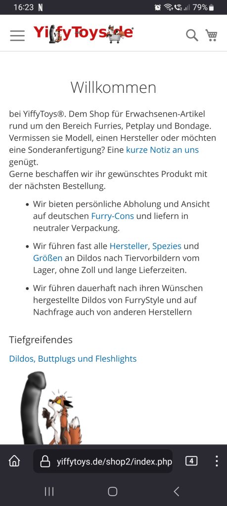
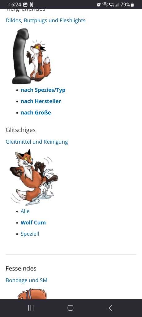
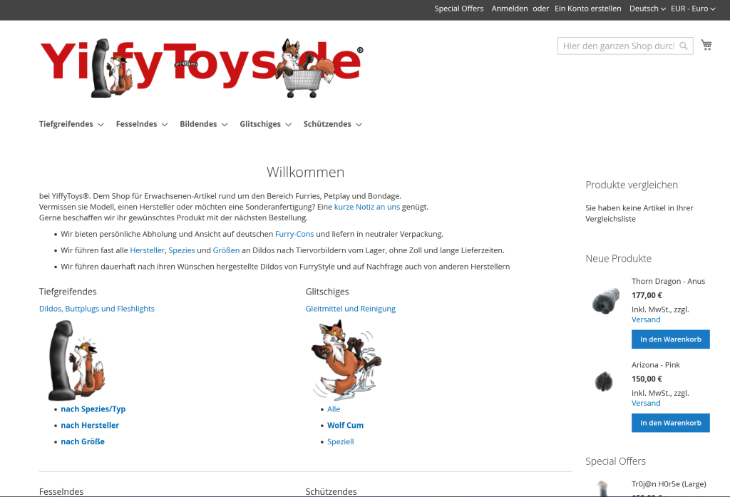
We just made the German home page of the shop more mobile friendly.
The English one is not updated yet.
What do you think of it? Please tell us!
Mobile
The category foxes are now displayed below each other on mobile devices instead of rendering the same way as on a desktop.
Formerly the introduction text would take up more then just the first screen,
before the actual categories would be shown.


Desktop (new)
Since everyone is only interested in toys and lube,
the other categories have moved down.
Also the introduction text has been shortened

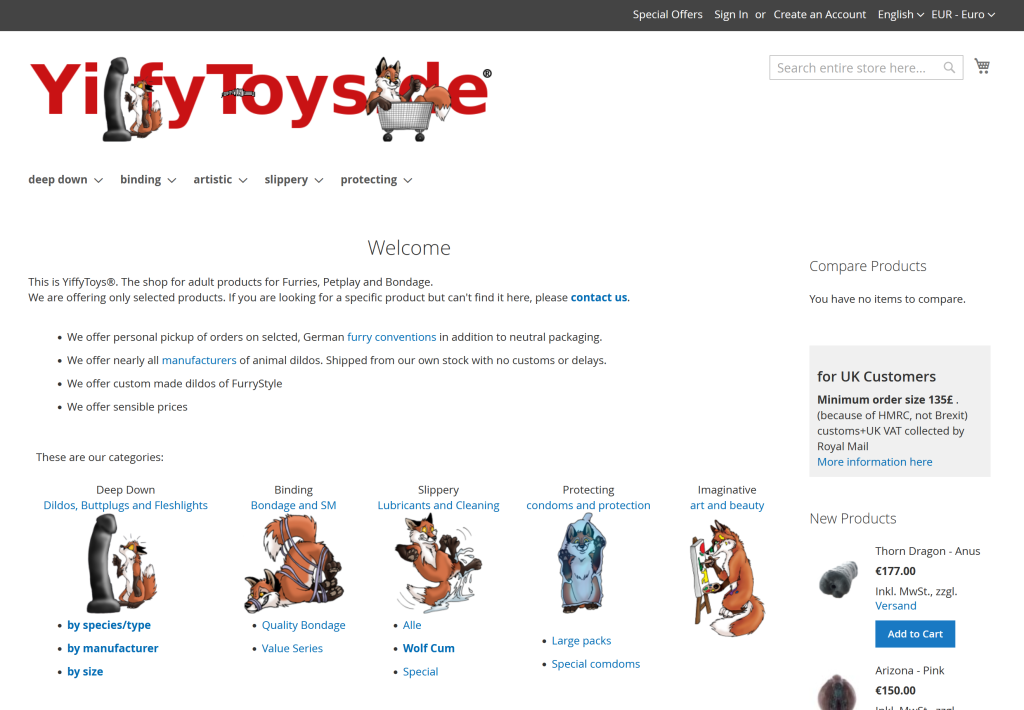
vs Desktop (old)
This is how it used to look up to this point.

